task
I designed the site for a person aged 20 to 40 with a creative background, who is interested in the artists and their workshop rather than a one-off fun evening. The school puts it this way:
We don’t prepare you for exams and we don’t sell hobbies.
concept
Cut naivety.
Someone else’s identity had to be continued, not copied, and at a reference workshop Nikita was most exact about a chair built of different concrete blocks: “different material, but cut, and something is built from it.” Cutting alone goes dry, naivety alone falls apart, so the site needs both.
reviews
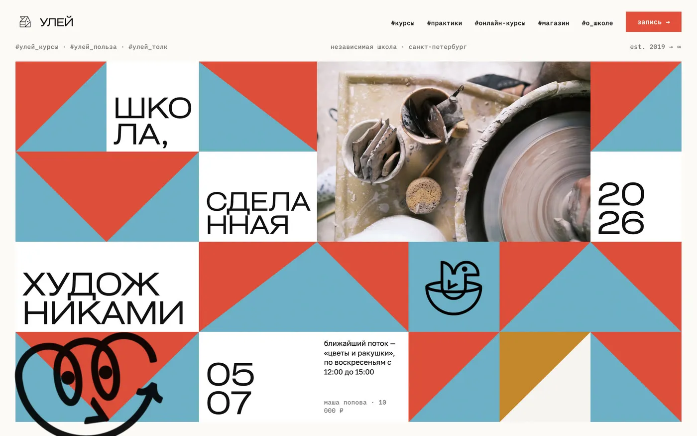
Quieter with every review.
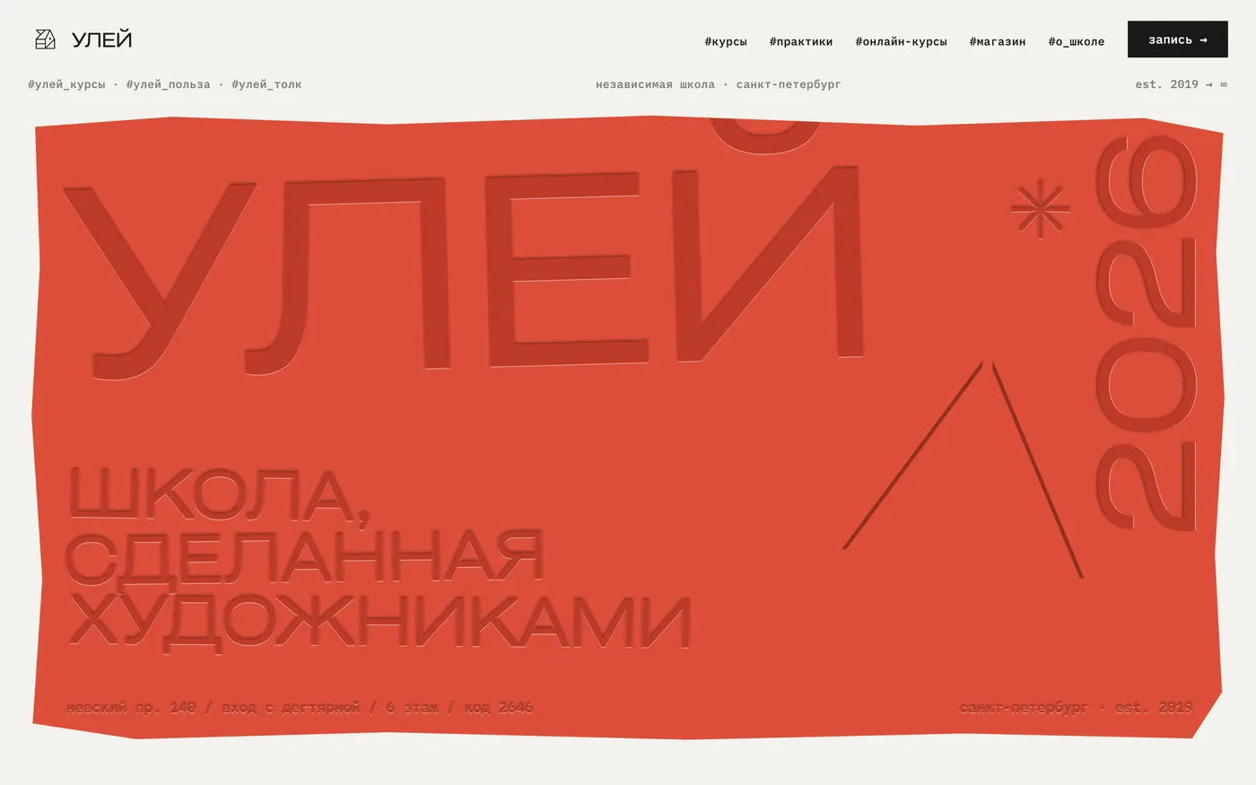
I showed two loud directions, a poster and a clay slab. Nikita chose the poster but asked to bring back a strict module, and after that every review took noise out of the interface: only the course posters and the creatures stayed loud.
home page
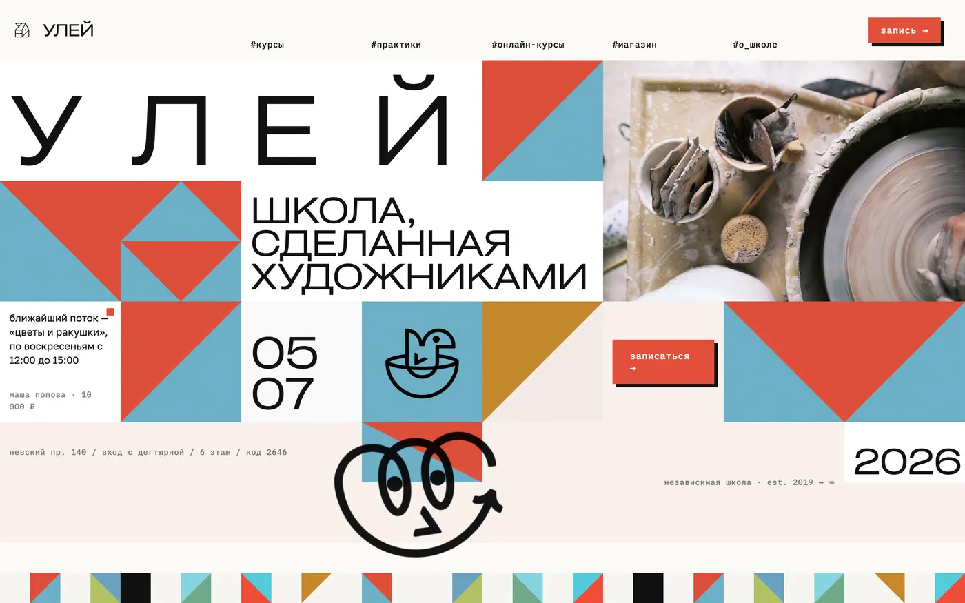
Naive things in a strict grid.
Drawings, ceramics and creatures stand in a modular grid: the grid keeps order, the drawing keeps it warm. A course card is cut from its poster, so a row of cards reads like the school’s posters on Instagram.
course page
A poster taken apart into a page.
Every course already has a poster, and it is stronger than any template. The painting goes into a house silhouette, the meeting dates become a mosaic of the course colours, and booking sits right under the facts, so the pages differ and the system stays one.

phone
Schedule and booking made for the phone.
A month grid on a narrow screen turns into squares too small for a finger. So on a phone the schedule became a strip of days with a list of sessions, and booking takes three steps.
what I dropped
A custom build with an admin panel and payments.
In a year Nikita will run the site, not a developer, and a custom system would leave the school with code nobody can fix. So the site moves to Tilda, where courses, payments and access work out of the box.
result
The site waits for the schedule.
The home page, courses and practices, the course pages, the common schedule and booking are built in code and run as a preview. I built the front end myself with Claude Code and Cursor, and once the real schedule arrives the site moves to Tilda.